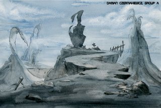
 Heh, This is the first painting assignment we had to do this year. Everyone did the same layout, but painted it however they wanted. It was an interesting experiment. I did another one, but that turned out like total crap, so I decided to do another one. That turned out to be a smart decision. I'm not gonna bother posting the first one I did, since that disaster of a painting is just plain embarrassing. Anyway, here's the new and improved version. The scan is not the best, but it's close enough to the original.

3 comments:
hey man i like this...really eerie
- NaBisco
Hey Damian, I like the dull colours in this one. And the clouds look really nice too. Good job man!
Thanks guys.
Post a Comment